AustinandElkins.com redesign: modernizing the online presence of a well-established local jewellery store
User Research | Information Architecture | Visual Design | Usability Testing
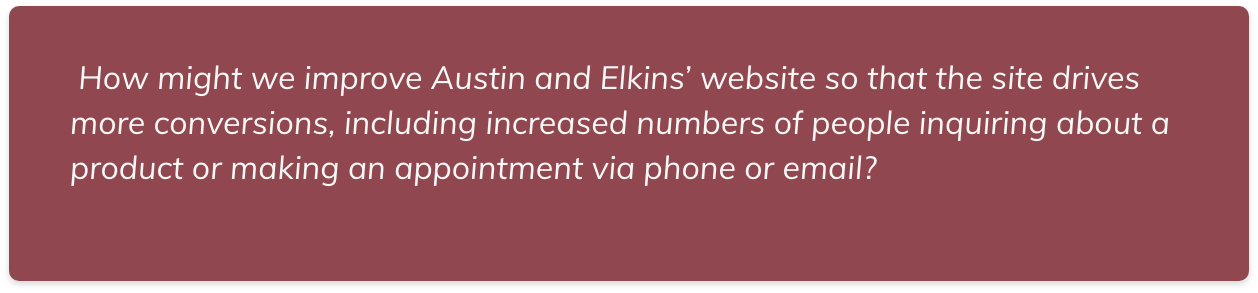
Goal
To redesign the UI of AustinandElkins.com to compel users to schedule an appointment with the jewellery store owner.
Role
UX UI Designer
Duration
September 2020 - May 2021
The Challenge
Austin and Elkins is a well establish jewellery business that has been operating for more than 30 years in Old Town Alexandria, Virginia. Based on research, the team observed that the website was not responsive, and did not clearly communicate the high quality of services and products it offers, which has the potential to cause less engagement and lower conversions.
Background
Austin & Elkins is a local, Alexandra-based fine jewelry store that has operated for more than 30 years. The business has a strong client base and is not looking to gain new clients due to personnel constraints and their business model. However, their online presence needs improvement and does not accurately reflect their high-end products. In the span of 12 weeks, the design team and I conducted user research to define user personas, information architecture to better organize and surface important content, created a prototype of a new visual design and carried out usability testing to ensure the site’s goals and user experience were met. Then, we deployed it on Wordpress.
The Process
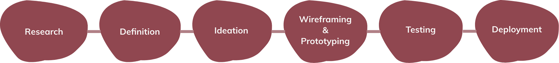
Research Methods
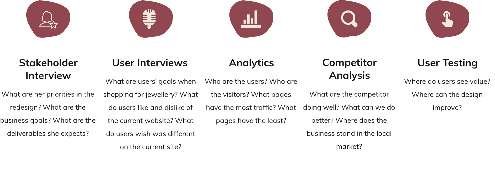
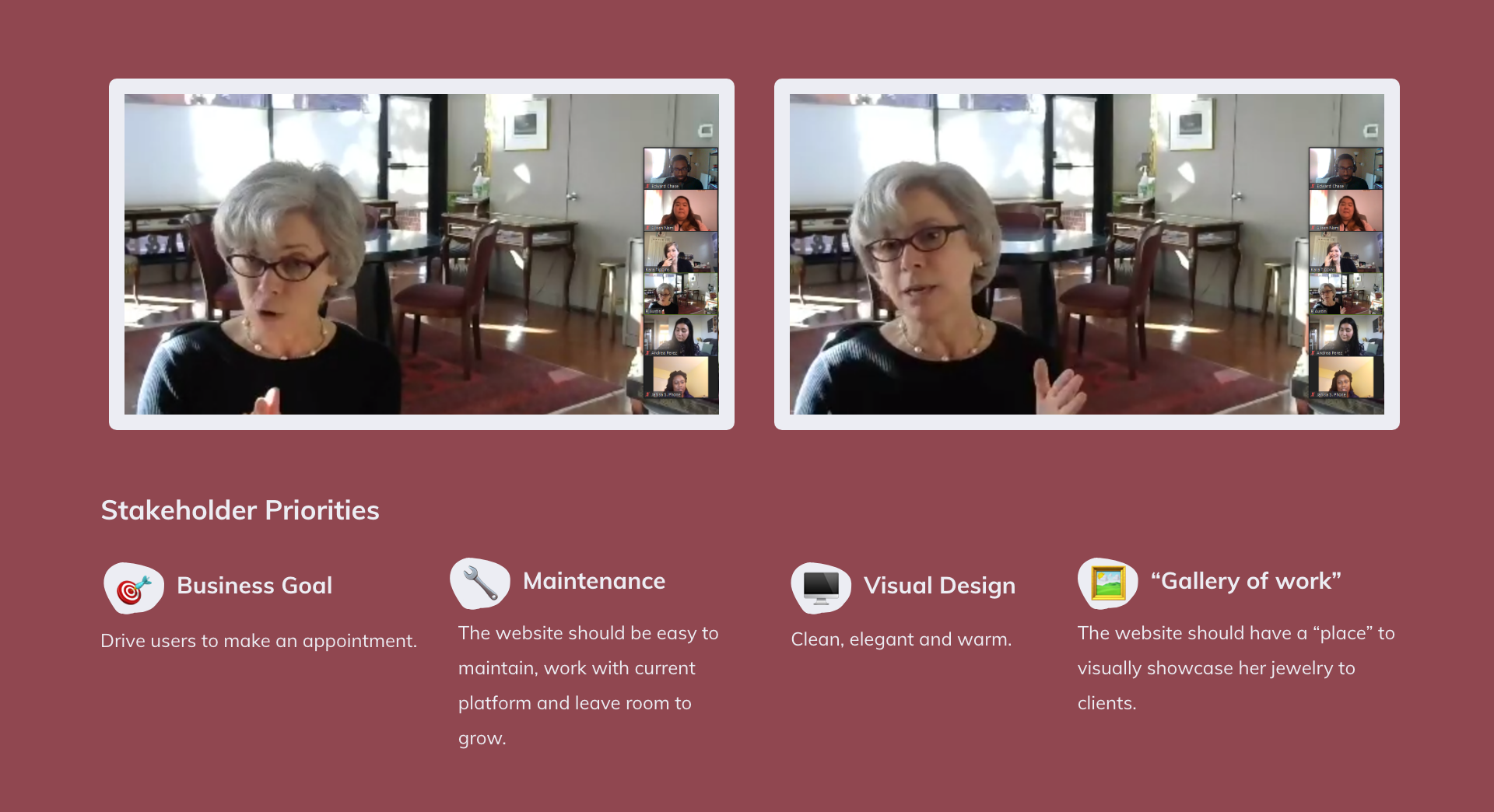
User Research: Stakeholder Interview
The first step in the user research stage of the redesign process was meeting with Robin Austin, founder and CEO of Austin and Elkins to have a better sense of her business goals, set timeframes, and determine deliverables.
Synthesis and Definition
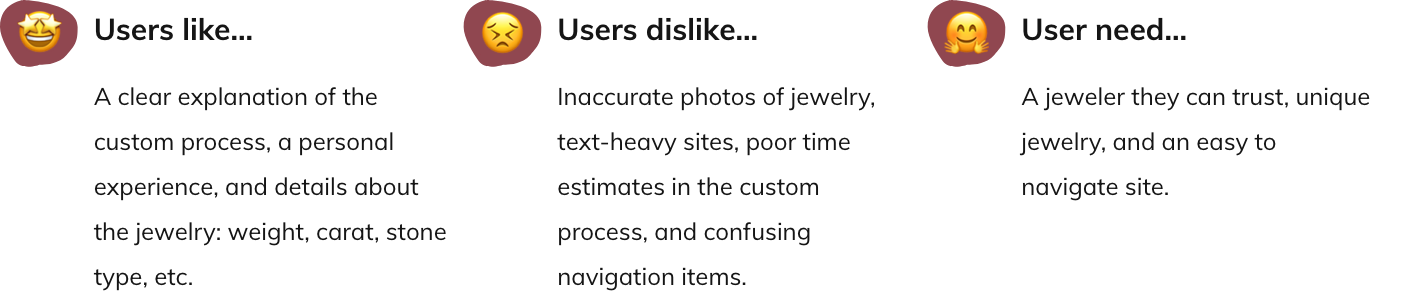
Key Insights from User Interviews and Preliminary Testing
Kara, the lead researcher of the project interviewed five users within the target demographics of Austin and Elkins clientele. After synthesising all the collected data, the team defined the “design principles” of the project to guide the product vision and design decisions of the project.
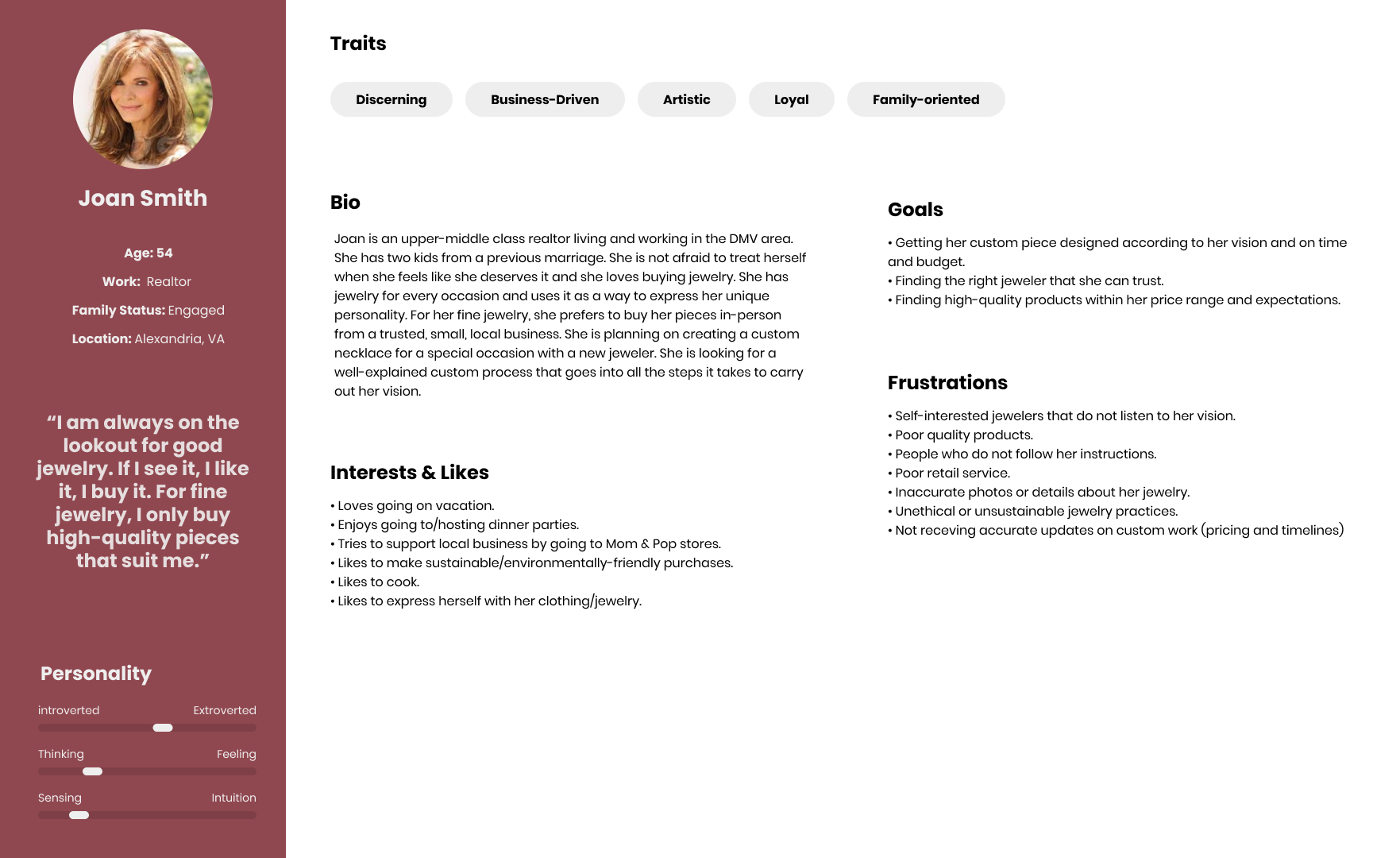
Persona Development: Meet Joan, the custom jewellery lover
The team gathered in a UX Workshop and condensed the data collected during the research stage into a persona: Joan Smith. Joan is an archetypical user whose goals, motivations, frustrations and characteristics represent the needs around unclear imagery, inaccurate jewelry details and self-interested jewellers.
Ideation
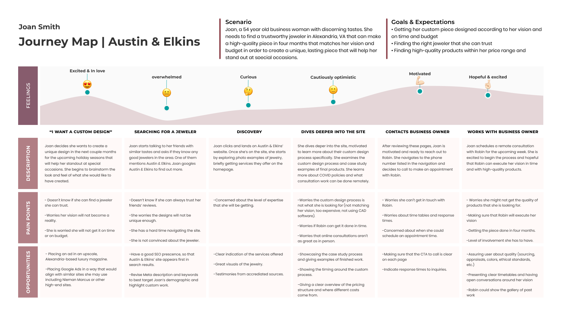
Mapping Joan's journey to her perfect custom piece
Part of the workshop's objective was to identify opportunities for the redesign of the website in a much clearer way. As a team we created a User Journey Map. We discovered some of those opportunities applied directly to us as the design team and I took them into account during the sketching and prototyping stage.
Design Evolution: From Sketches to Hi-Fi
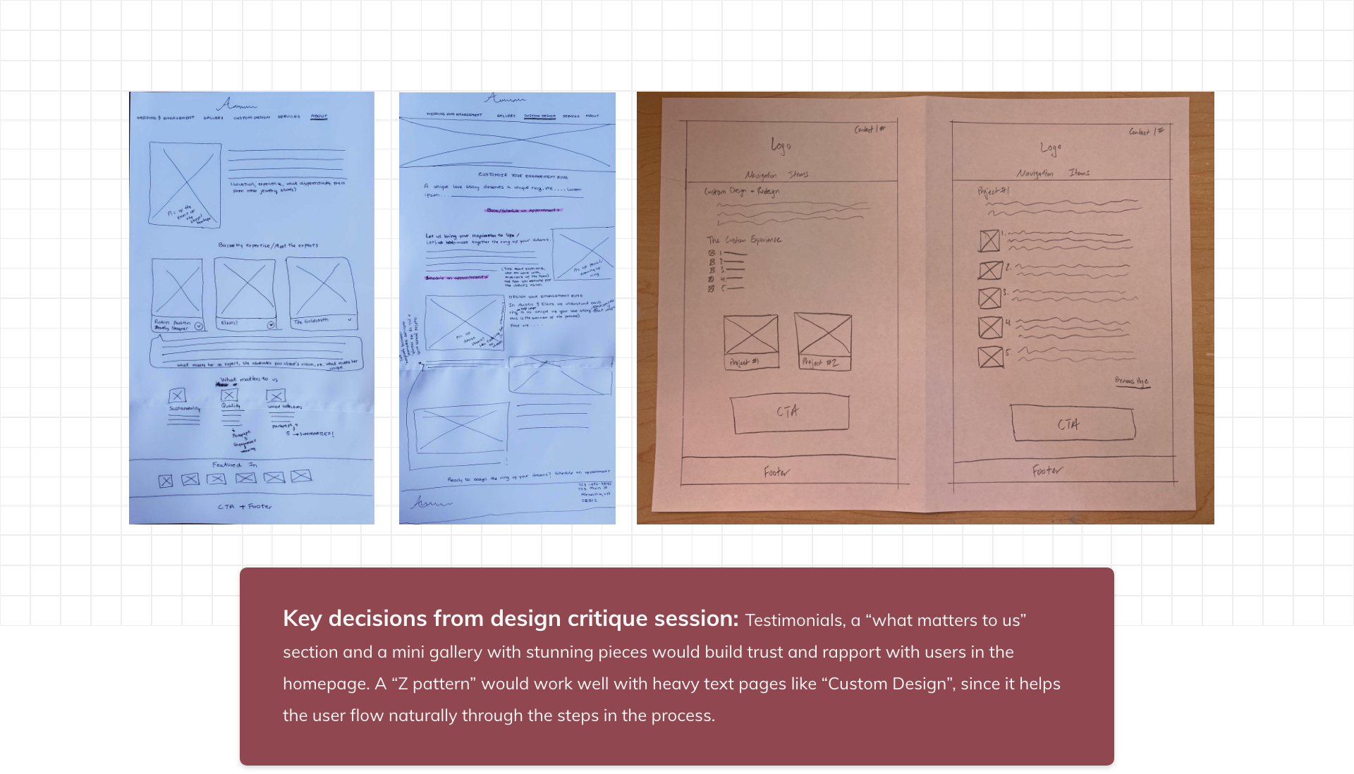
Sketches
The team and I put their ideas into rough sketches to have a better sense of the vision each member of the team had of the redesign. After a design critique session, the team decided on the key elements that would be part of the low-fidelity wireframe and prototype to gather feedback from users.
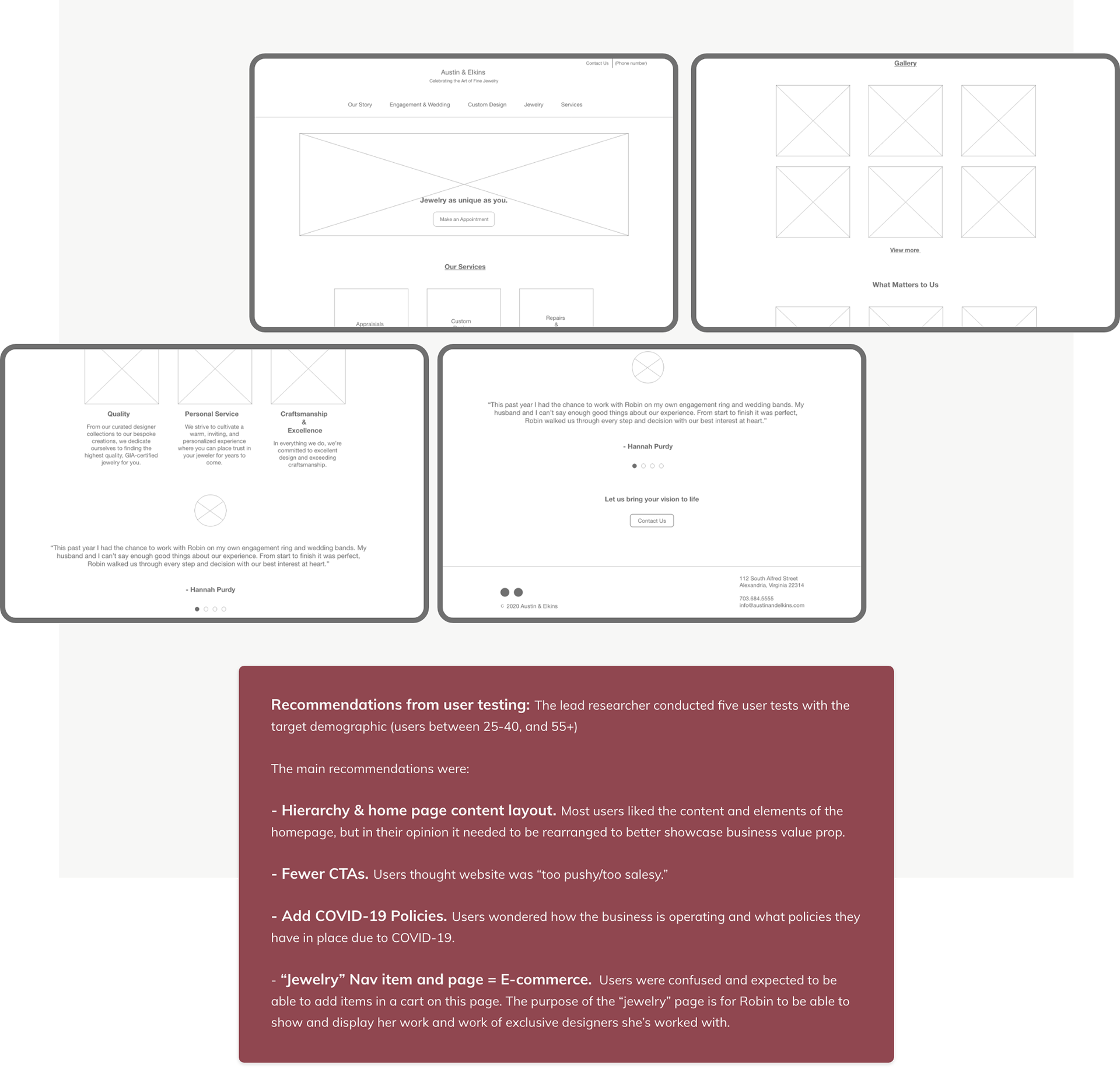
Low-Fidelity wireframes and user testing feedback
I created a low fidelity wireframe and prototype using Adobe XD. This prototype was used to conduct five usability tests and to be shared with the stakeholder to validate we were on the right path.
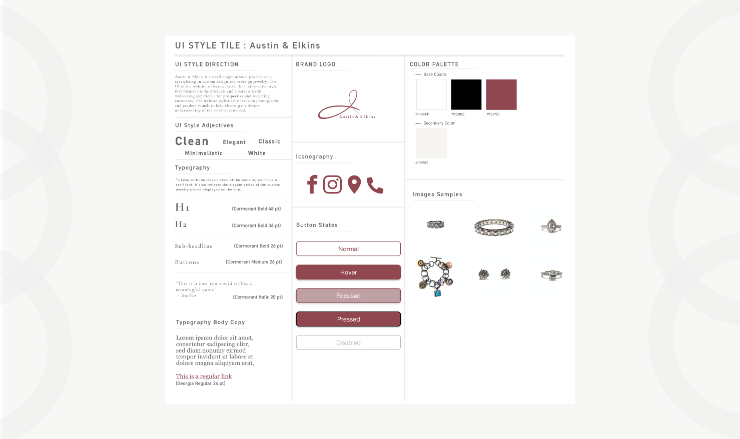
High fidelity... Before that: Style Tyle to create consistency!
Before going into "hi-fi" mode I thought it would be a good idea to have a "guide" in order to create consistency among the wireframes the team had to complete. The team and I decided to keep the "burgundy color" since most local jewelleries had a turquoise color. It'd make Austin & Elkins stand out.
High-fidelity wireframes: the many iterations to get there
With users’ insights in mind from the low fidelity user testing, I designed the high fidelity designs of the site with the help of other designer in the team. Along the way we encountered many challenges. One among them was finding the balance between “clean” and with "lots of white space" as the stakeholder envisioned it, but with enough details and interactions so it would not come as “too plain/flat”. The way we tackled the challenge was by creating different versions of the design. We played with different colors from the chosen color pallet, re-arranged elements, pictures, illustrations and icons. Finally, I added subtle interactions in a way that was not distracting to the user.
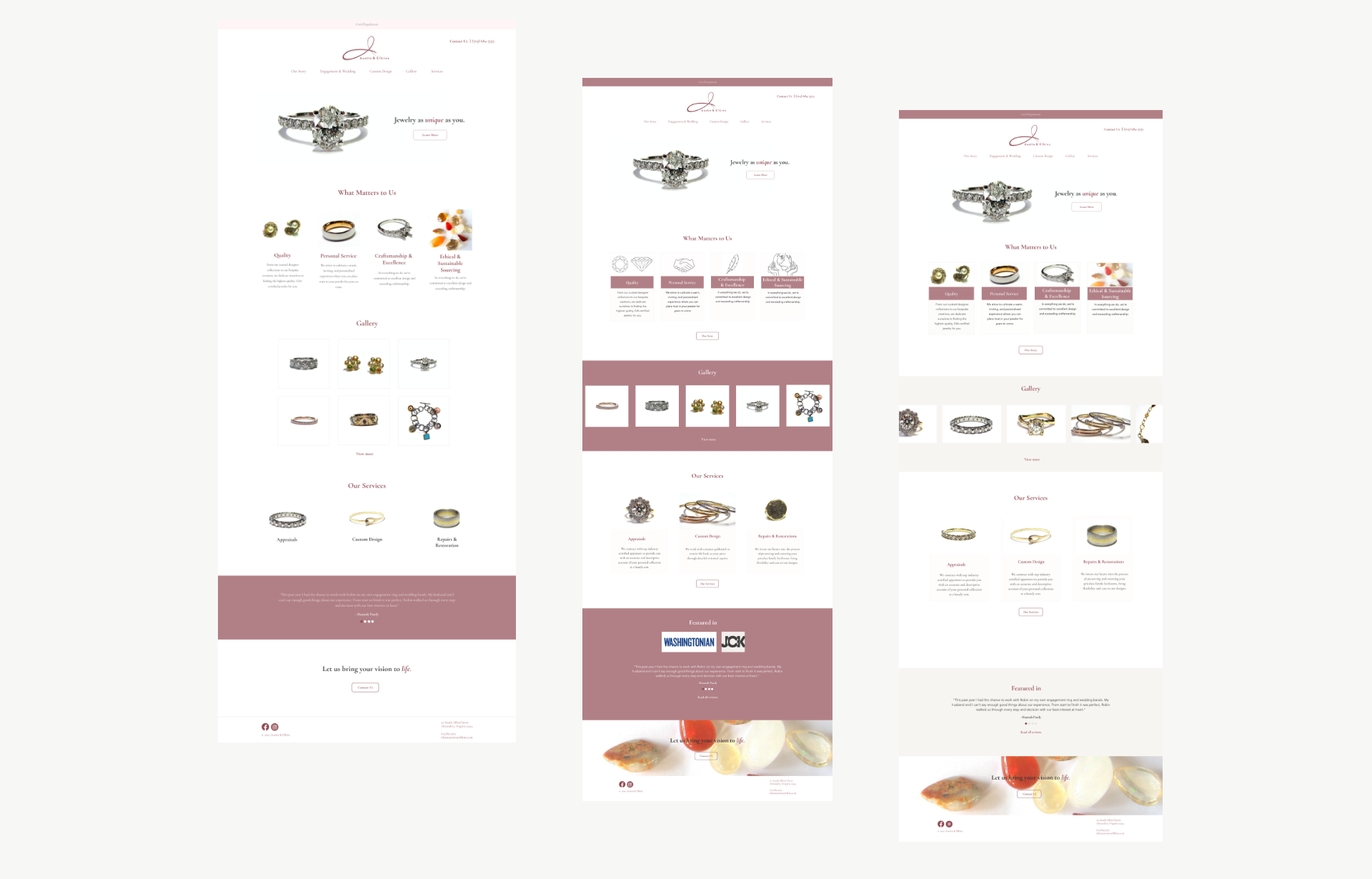
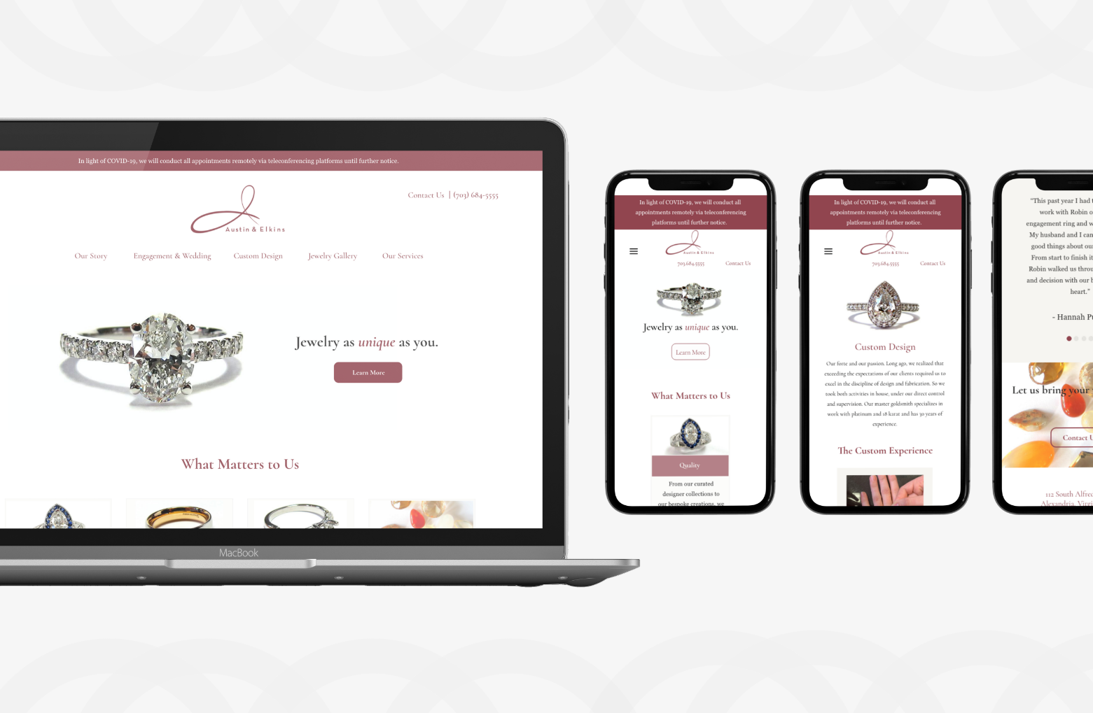
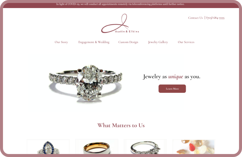
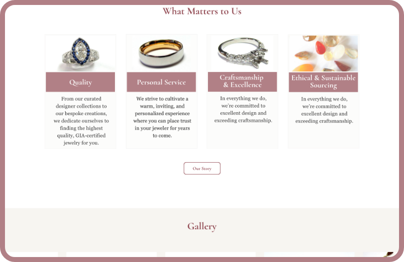
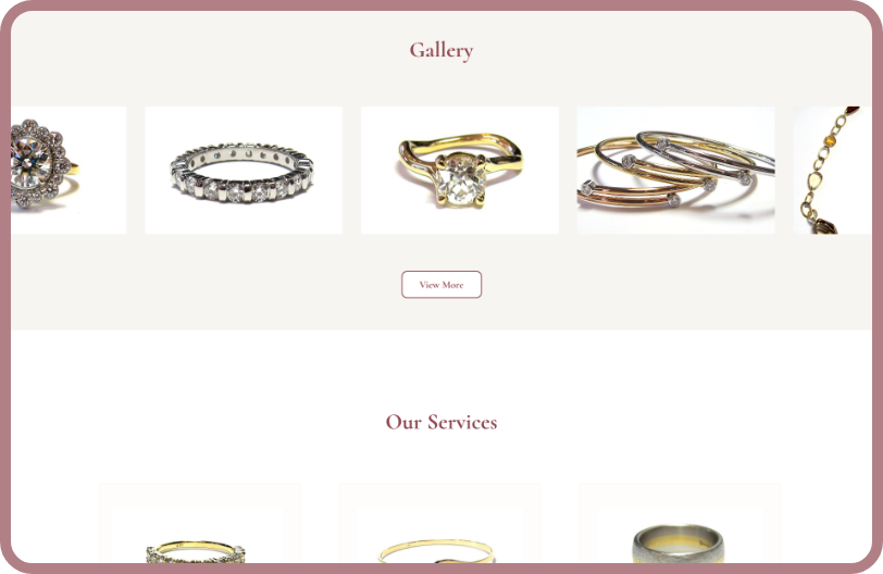
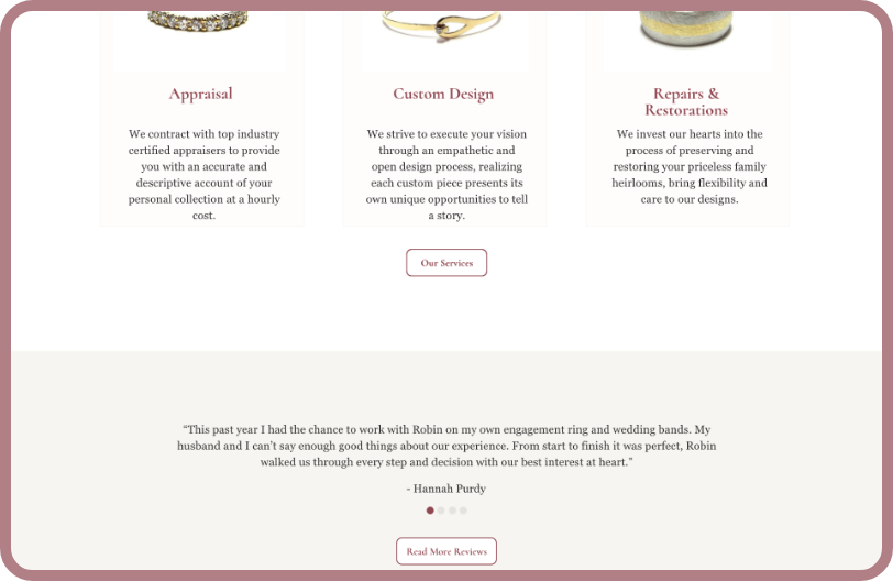
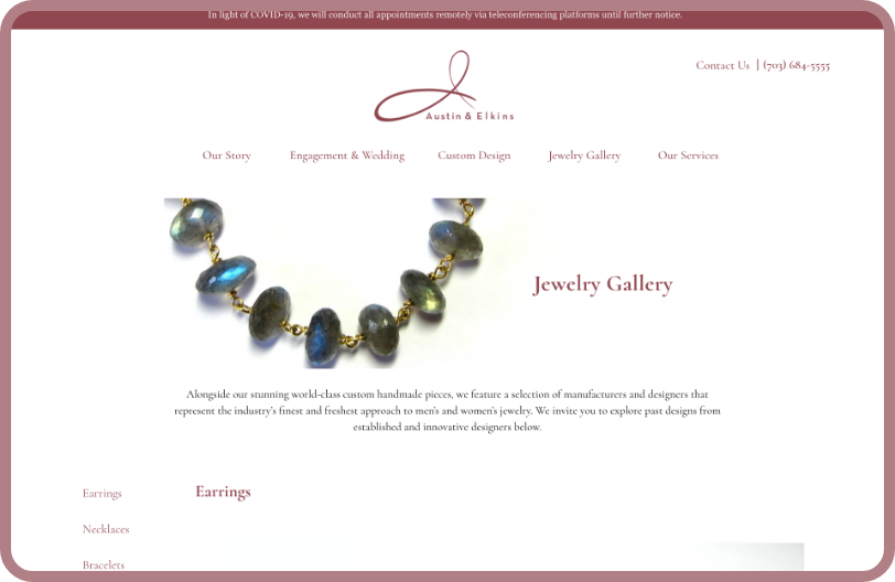
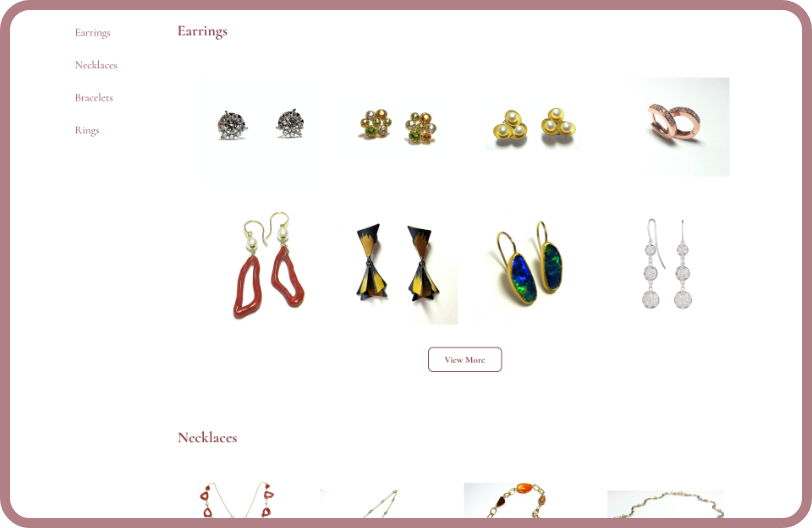
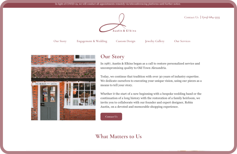
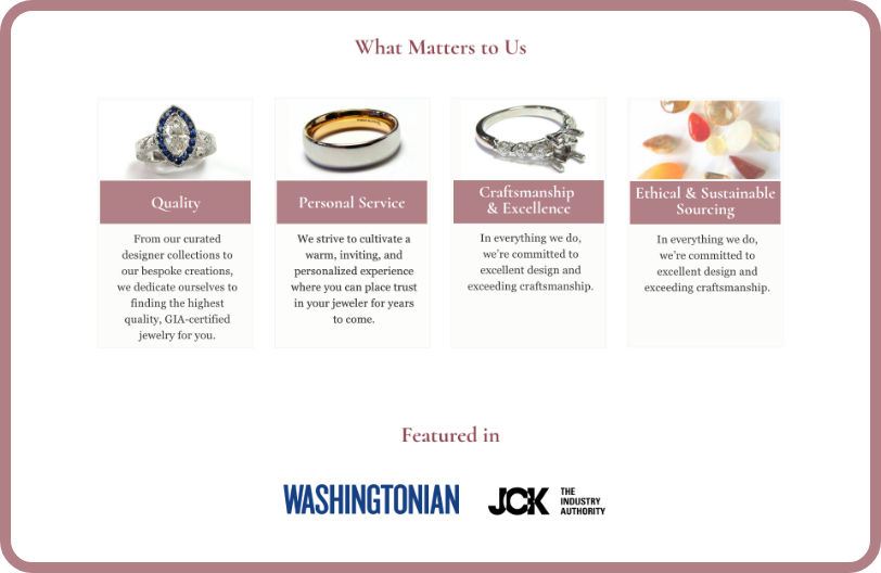
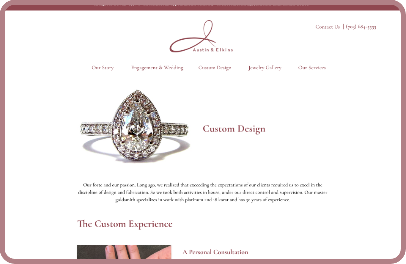
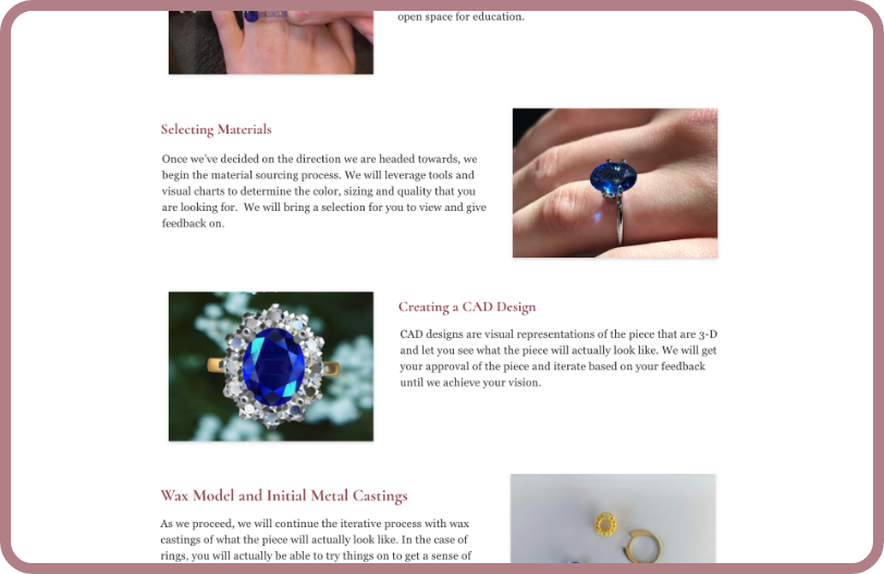
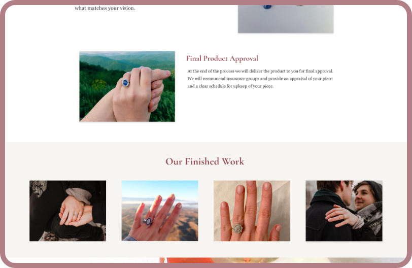
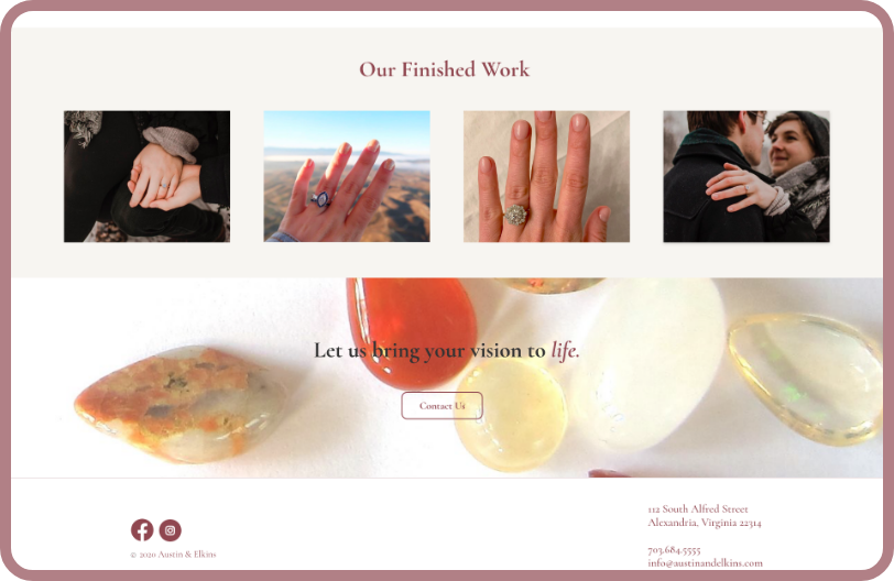
The Final Product: Desktop
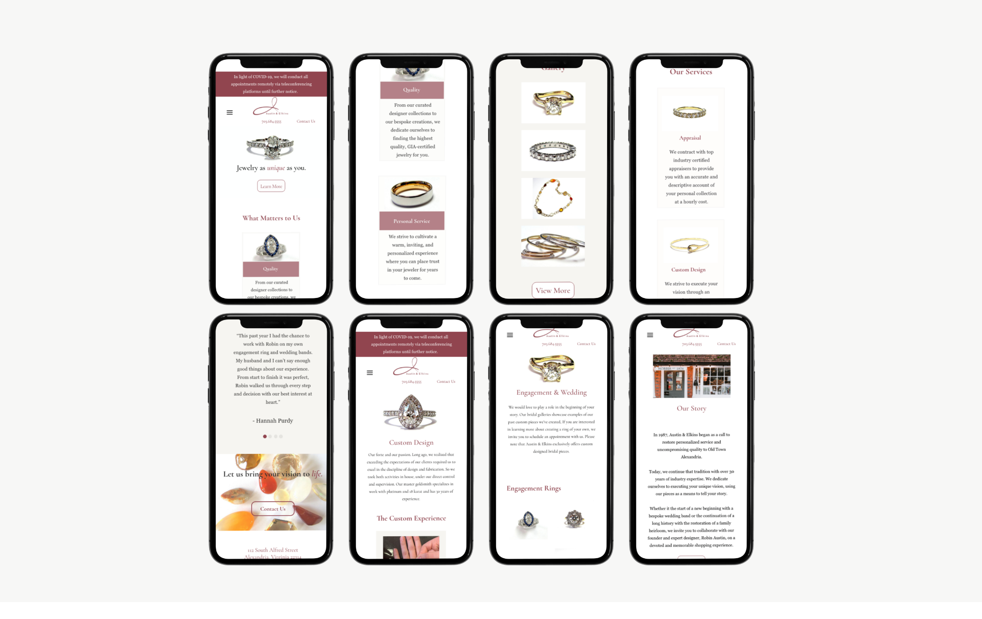
The Final Product: Mobile
Reflection & Future Plans For Austin and Elkins
01. Austin and Elkins was my first project working directly with a stakeholder and client. I learned that constant communication and validation with your client is key to the success of the project. I learned that research data helps back up design decisions that benefit users but stakeholders may not agree with. Research data helps stakeholders empathize with their clients better, too.
02. A future plan is to add information about the jewelry. Unfortunately, due to time constraints, Robin did not have the time to collect all the information and details about the jewelry pieces displayed on the website. That doesn’t mean she’s not interested, and she will try to do it herself in the future.
03. Finally, I learned that I should not set on the first design or first idea. Iterating and exploring different possibilities can open the door to better designs! After this project I made sure I explore several ideas in the early stages of the design, present them to my team and hear their perspectives!