Ayuda.com Redesign: helping a local non-profit showcase their impact in the community.
User Research | Information Architecture | Visual Design | A/B Testing
Goal
To redesign the UI of Ayuda.com to increase clarity, organization, usability, and donation conversions.
Role
UX Researcher and Designer
Duration
July - August 2020
The Challenge
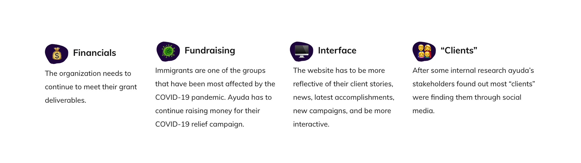
Ayuda was designed to create a community where all immigrants succeed and thrive by providing low-income immigrants resources and volunteers a way to contribute with the cause. Based on research, we observed that the website does not clearly communicate Ayuda’s mission or the impact their services provide, which has the potential to cause less engagement with the organization and lower donation conversions.
Background
My team and I were assigned to redesign a responsive website for a local nonprofit. We chose Ayuda because we believe immigration issues are such a relevant topic today. My team and I are immigrants and children of immigrants, so we were very passionate about this subject. Furthermore, we are aware of the fact that the Trump administration was limiting resources available for immigrants. Additionally, we wanted to be a part of an organization that has a mission of protecting victims of abuse and providing free legal resources to help them strive for a better quality of life.
The Process
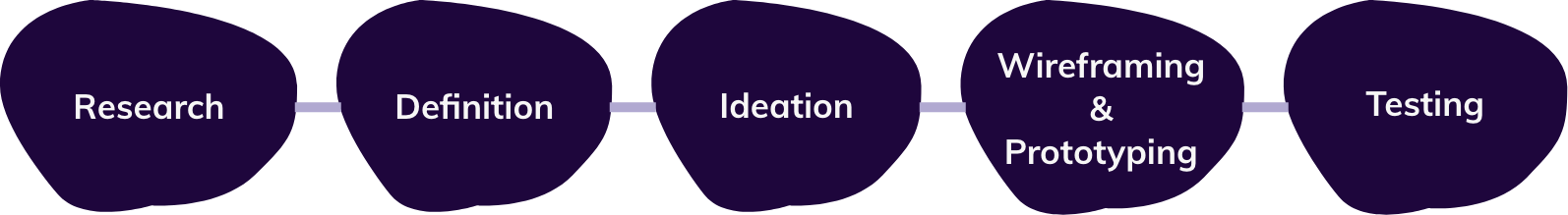
But first... The bumpy road to the solution
The first challenge we encountered as a team was time: a solution was needed in three weeks! With that in mind we created a timeline of deliverables for each week and broke down tasks on Trello in order to make it more manageable.
User Research
Prior to this project I had always thought the first step in research is having a workshop or interview with stakeholders. Well... in this case that was a problem because the only stakeholder available to interview with the team had time on week 2 of the project and not on week 1 as the team had planned. I was afraid of not following the "right" process at first, but after taking a step back to look at the bigger picture I realized there was research that could be done without interviewing the stakeholder first! So I put my strategic hat on and completed a competitor analysis, a heuristic evaluation of the current site, and five preliminary user testing sessions.
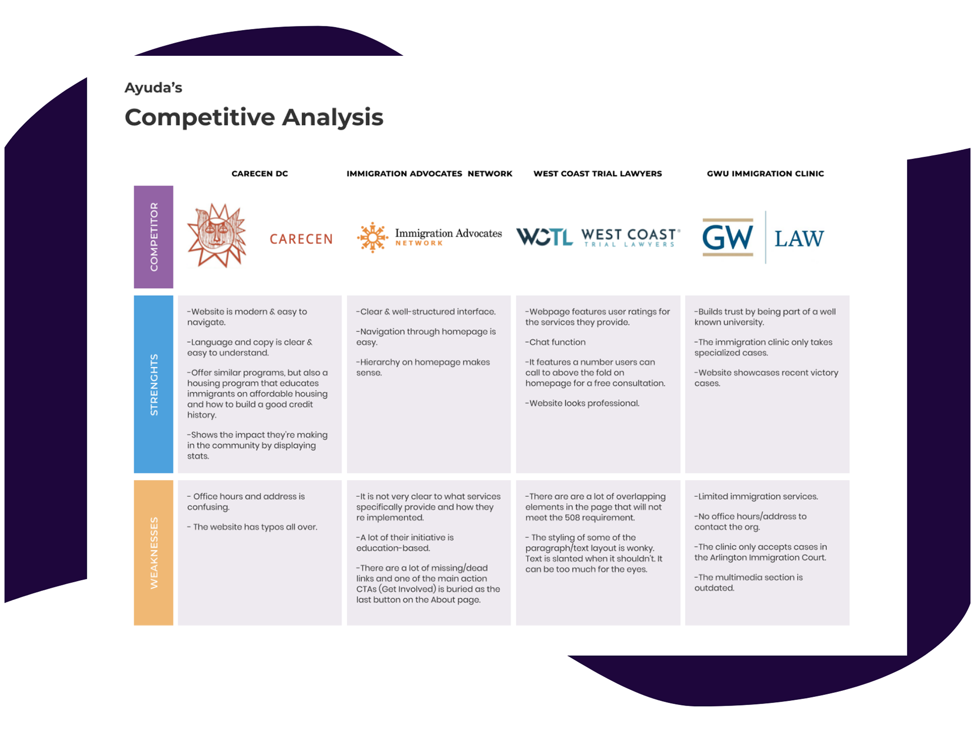
Getting to know the "competitors"
I conducted a competitor analysis with four non-profits to figure out where Ayuda stood, what their competitors were doing well with their website and what could be improved, as well as to find some inspiration for the redesign.
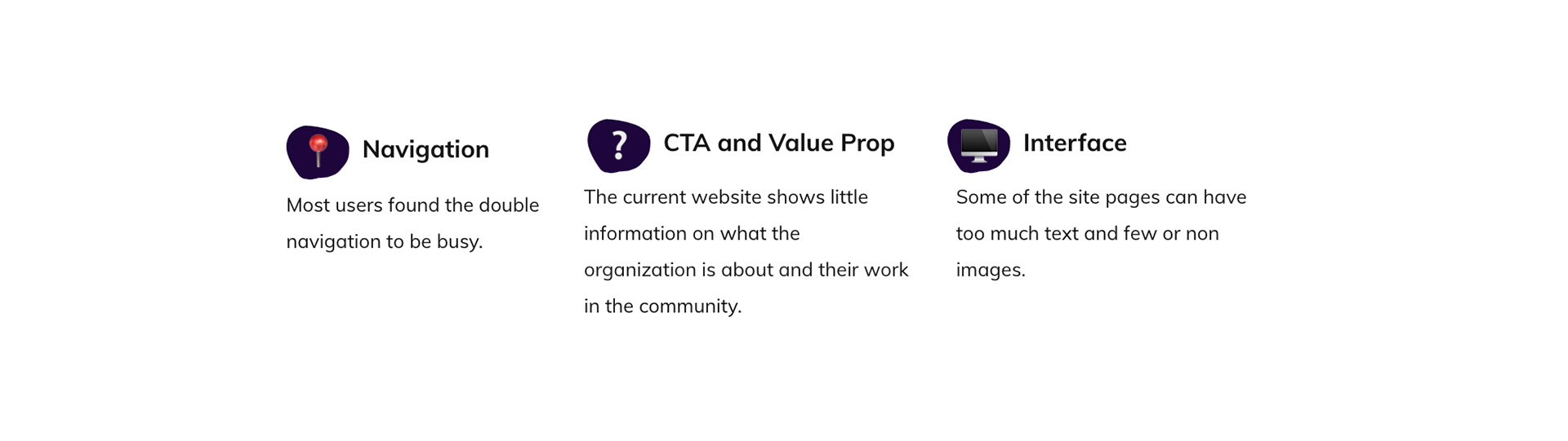
Preliminary user testing: what's frustrating users on the current website?
I conducted five preliminary user testing sessions with the target audience of the new website (users 25-45 years old that are interested in immigration and helping immigrants) The preliminary testing helped me discover the main weaknesses of the website in a non-biased way and it backed up the heuristic analysis annotations I had made earlier in the process. The main findings are featured below.
Stakeholder Interview: getting to know the business side of the project
During the initial stage of the redesign process the team met with Laura Catania, a stakeholder at Ayuda. After our conversation with her I discovered the organization's short and long term goals and their redesign vision. It was interesting to find that the audience of the new website should be donors and funders, and not immigrants in need, like the team had originally thought. Fortunately, we were still in the early stages of the projects and quickly switched our strategy. Below, are the main takeaways of the stakeholder initial interview
Definition
Persona Development
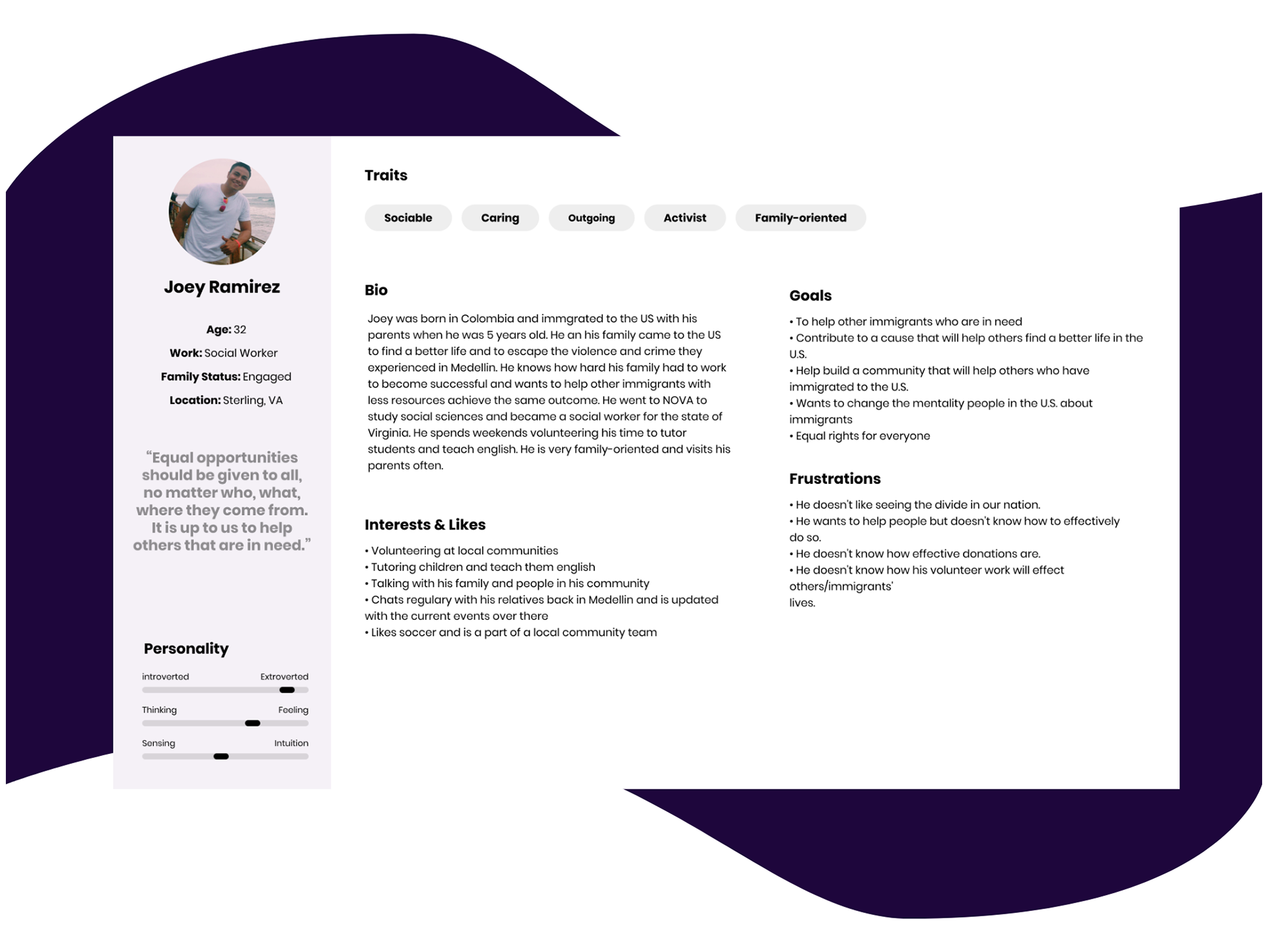
I condensed the data collected during the research stage into a persona: Joey Ramirez. I decided to make the persona a volunteer/funder based on the stakeholder interview, the fact that most immigrants seeking for help (clients) are finding the organization through social media, and their desire to make the website better for the community and their funders.
Ideation
Mapping the journey to get involved with Ayuda
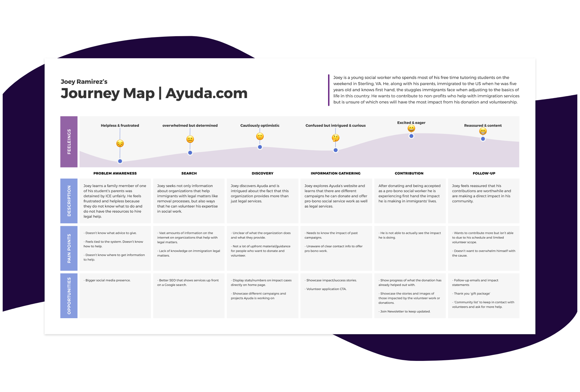
As an advocate of a holistic approach in design, I am keen to find design opportunities that not only benefit end users, businesses or the design team. But also, the marketing and development teams, to mention a few. An artefact that helps me reach said desired outcome are user journey maps. In this case, I mapped the journey of Joey Ramirez in trying to find a meaningful cause and an impactful organization to donate and volunteer.
Information Architecture
Creating a new sitemap
One of the main pain points and most common feedback I got from users during the preliminary testing stage was that the navigation bar was too crowded with tabs. There were 8 tabs on the main navigation bar on the current website. They were organized into two rows. The amount of space it took up was something I knew had to change.
Based on that, as well as the heuristics evaluation conducted at the beginning of the project, I modified it by evaluating each navigation item. By doing so I realized there were some items that were repetitive and/or items that did not need to be a part of the main navigation. To validate the new sitemap I conducted a in-person open card sort exercise and an online closed card sort. The new sitemap makes navigating the website an easy and intuitive experience.
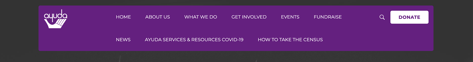
Ayuda's current navigation bar.
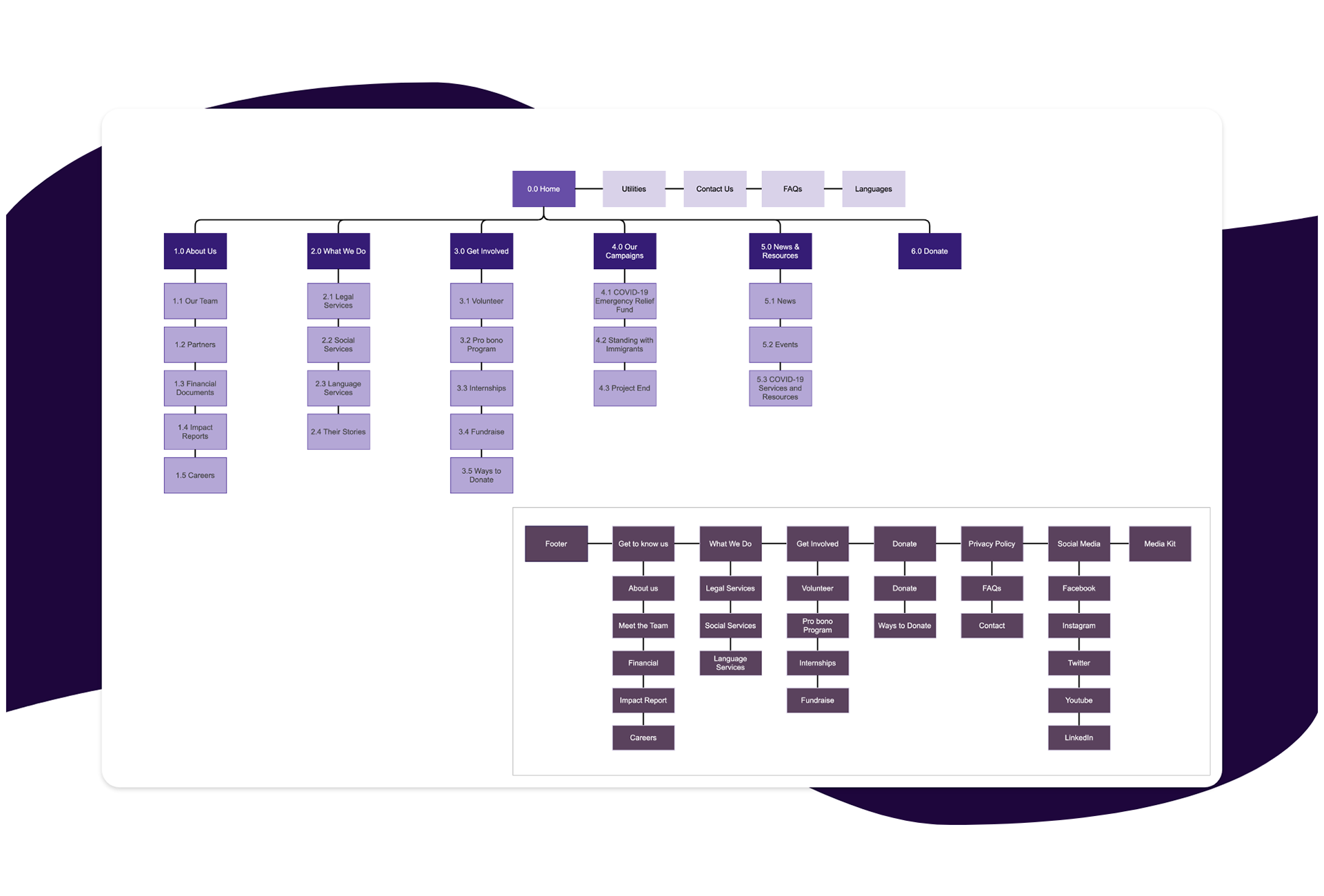
Ayuda's new sitemap.
Wireframing & Prototyping
A/B Prototypes
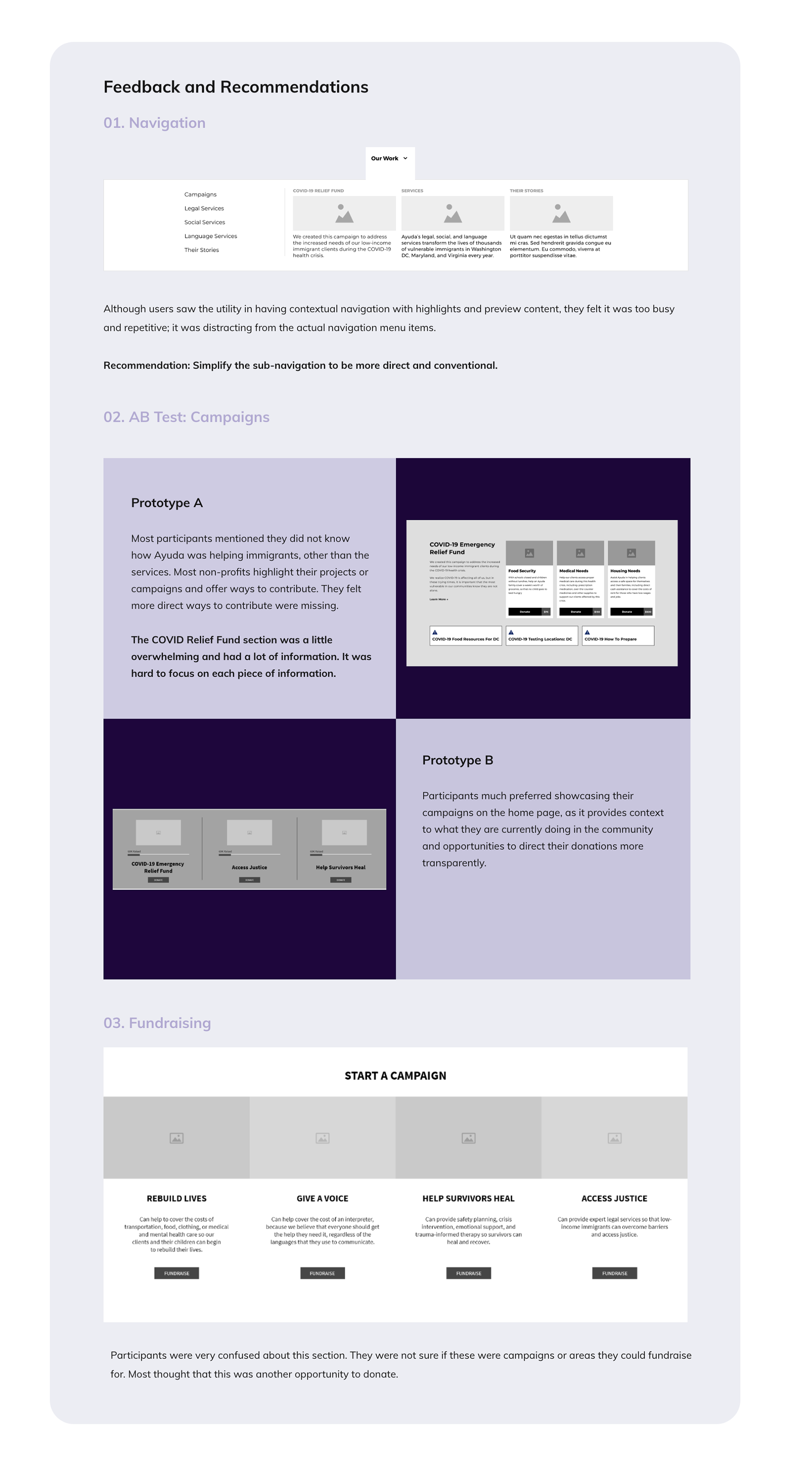
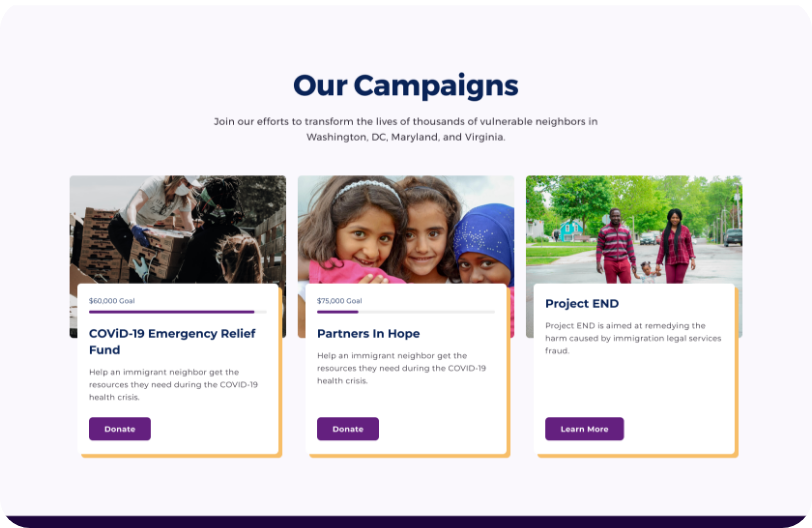
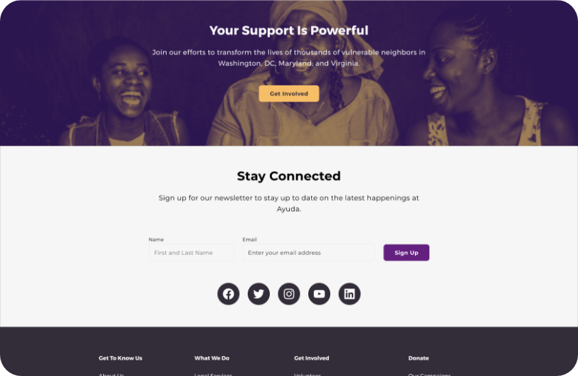
After initial sketches the team created two low-fidelity prototypes in order to test the hierarchy of information on the homepage, and contextual navigation vs conventional. As well as different sections like “Start a Campaign” vs “COVID-19 Relief Fund”. CTAs under hero section vs funding progress in different fundraising events to find out which would have more impact with users and would help the organization reach their business goals.
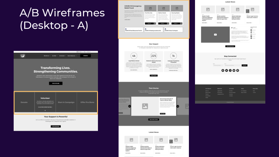
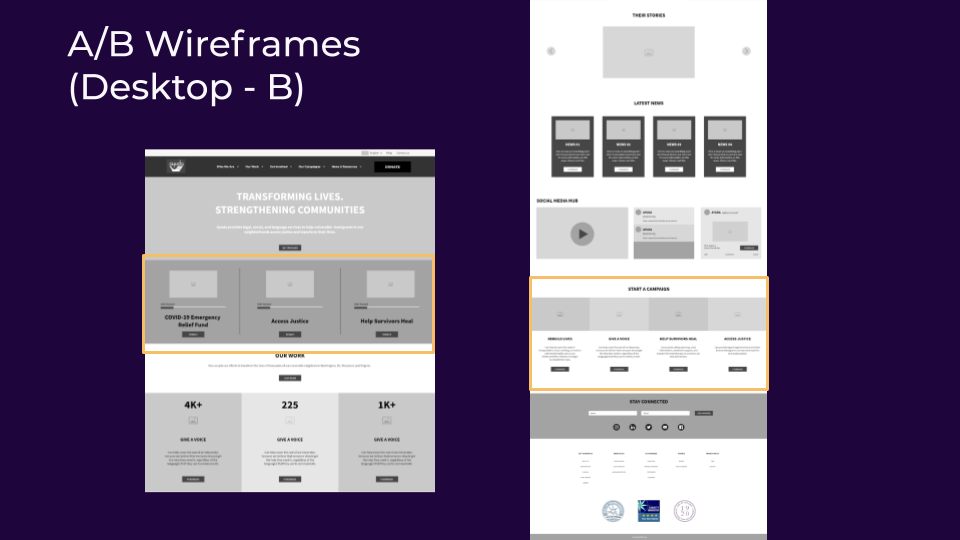
The yellow boxes represent the sections the team wanted to test. Special attention was given to them during the testing sessions.
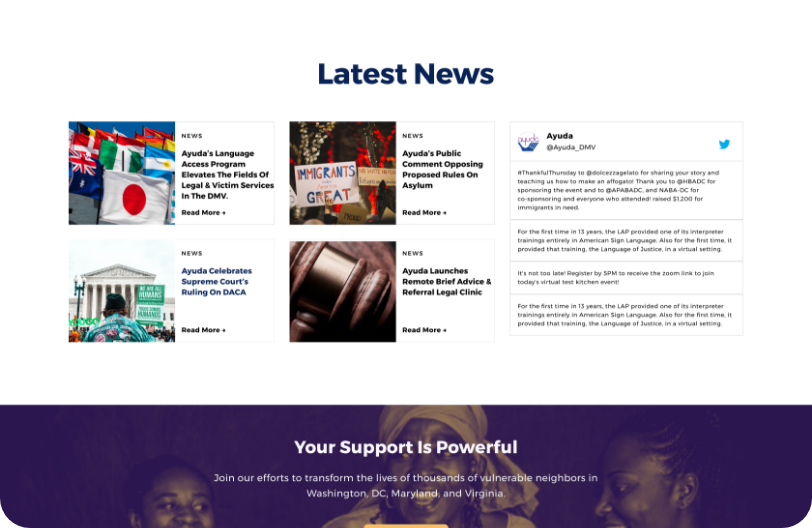
User Testing: did we "nail" it?
I conducted five tests with different users for each prototype. After analyzing the data collected through each test, I informed the team users preferred conventional navigation and did not see value in contextual navigation, except for the navigation item "News & Events". Users were confused about the "COVID-19 Emergency Relief Fund", but appreciated the "progress bar" displayed to show how closed the organization was to reach their fundraising goal.
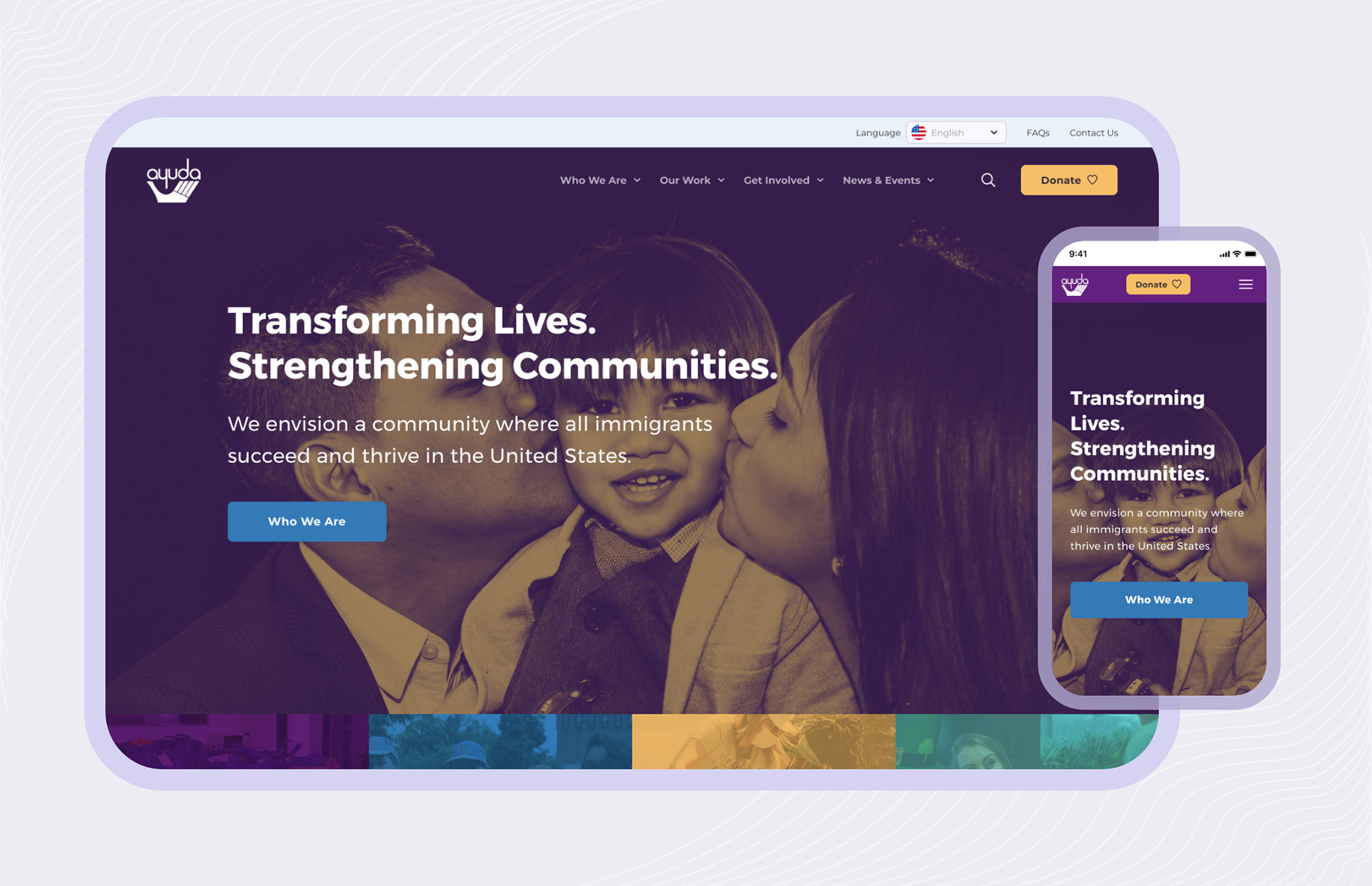
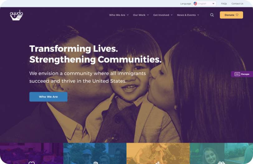
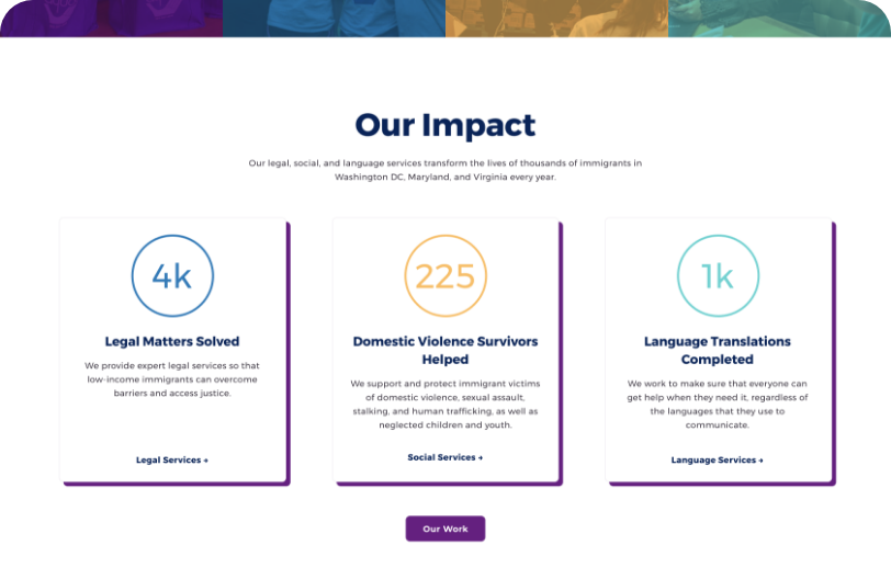
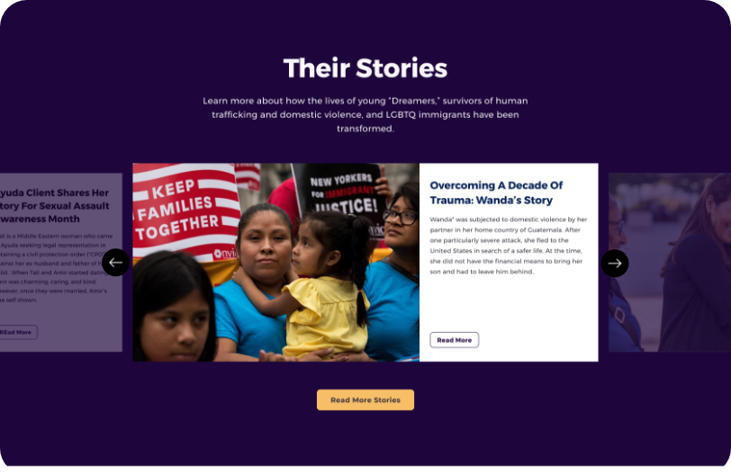
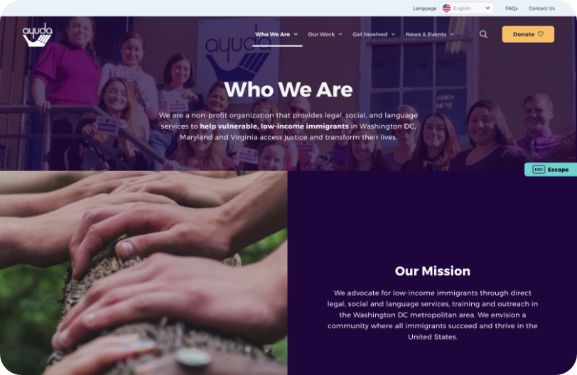
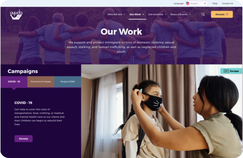
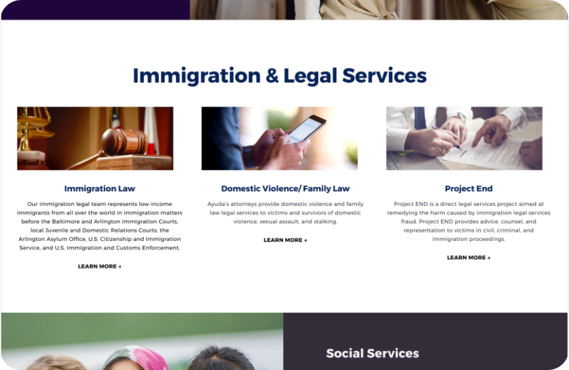
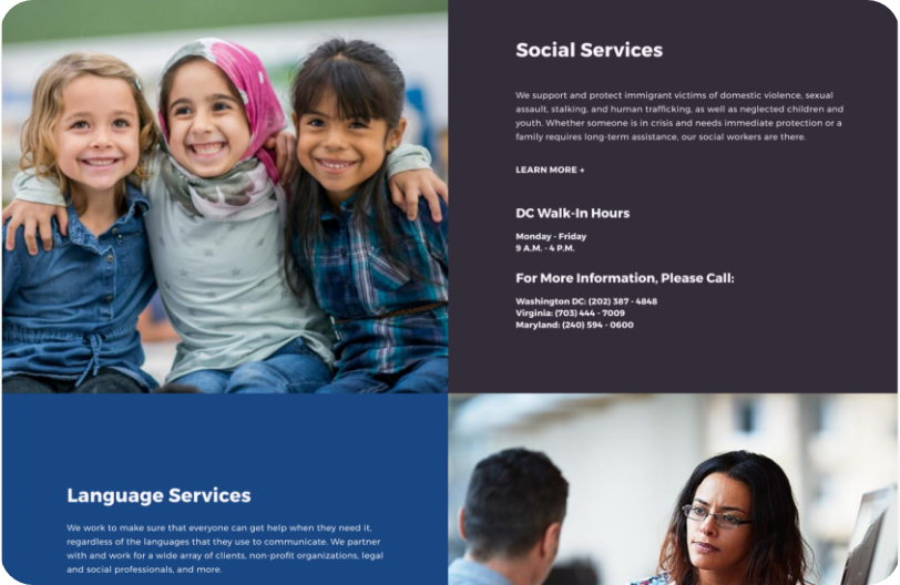
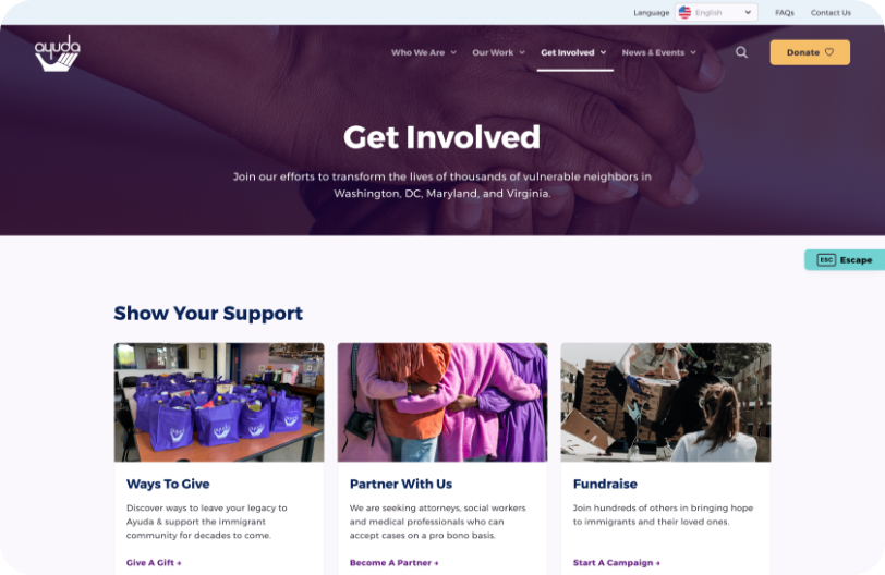
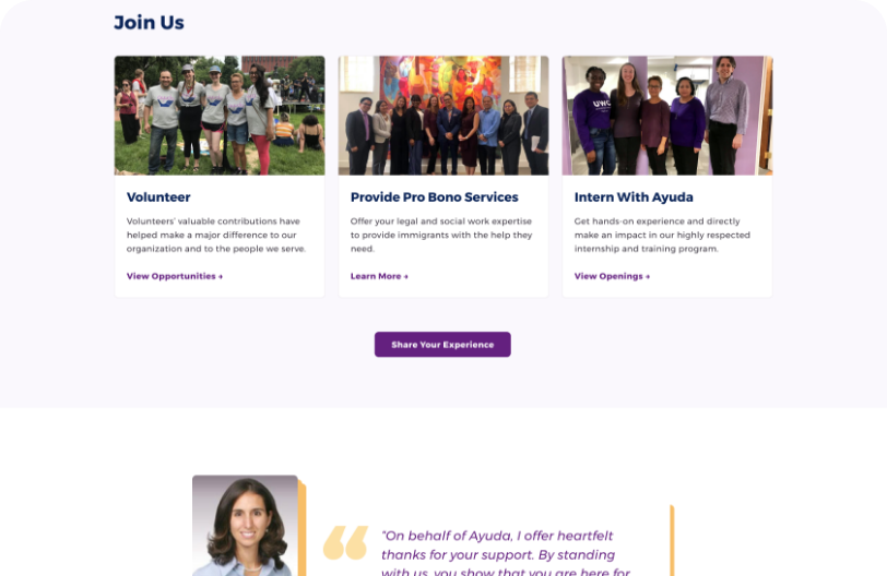
High Fidelity Prototypes: Desktop
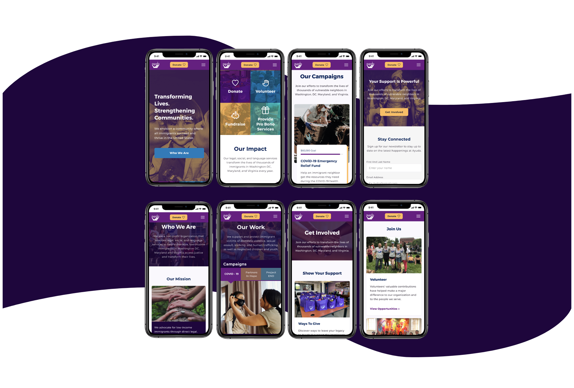
High Fidelity Prototypes: Mobile
Reflection & Future Plans For Ayuda
01. Prior to working on the redesign of Ayuda I used to believe as a UX designer I needed to complete every step in the design process in order to create a user friendly product. After this project I understood better that as a designer I also need to decide which steps and methods should be used based on the objectives and constraints of the project.
02. I realized I've been working in a waterfall-like process. With the help of Trello and my team members we succeeded at redesigning Ayuda in a more agile process. I am still learning about it and plan to certified myself within the next year.
03. Future plans and development for Ayuda include: Integrated donation & campaign system to consolidate all contribution avenues; integrated Volunteering admin system to easily add, edit, and update volunteer and pro bono availability; and a dedicated advocacy and policy section to showcase Ayuda’s efforts to influence policy changes in the immigration system.
Questions? Comments? Want to say👋🏼?
Shoot me a message if you want further details about this project👇🏼
andreaperezlosada@gmail.com